Code
import pandas as pd
import matplotlib.pyplot as plt
import matplotlib.dates as mdates⬅️ Previous Session | 🏠 Course Home

Don’t forget to start your notebook with a cell containing the import statements you need for the session.
import pandas as pd
import matplotlib.pyplot as plt
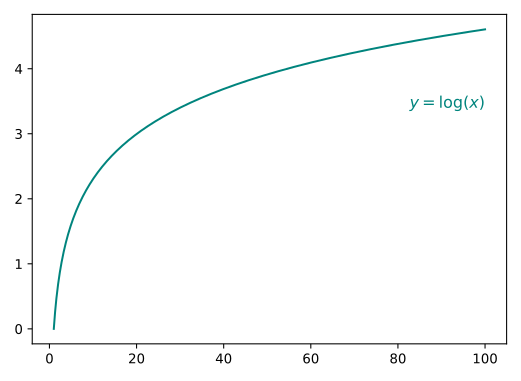
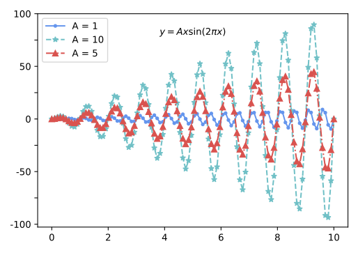
import matplotlib.dates as mdatesRecreate the plot below. You do not need to match the colors exactly, but do not rely on matplotlib defaults. Note: do not worry about the equation(s); these are included to indicate which functions to plot.
import numpy as np
import matplotlib.pyplot as plt

# Generate x values from 0.1 to 100 (avoiding x=0, which is undefined for log(x))
x = np.linspace(0.1, 100, 1000)

# Calculate y values using the logarithmic function
y = np.log(x)

# Create the plot
plt.figure(figsize=(8, 6))
plt.plot(x, y, label='y = log(x)', color=(19/255,121/255,112/255))
plt.xlabel('x')
plt.ylabel('y')
plt.title('Plot of y = log(x)')
plt.grid(False)
#plt.legend()
plt.xlim(0, 100)
plt.ylim(-2, 5)  # Adjust the y-axis limits as needed
plt.show()Recreate the plot below. You do not need to match the colors exactly, but do not rely on matplotlib defaults. Note: do not worry about the equation(s); these are included to indicate which functions to plot.
# Generate x values from 0 to 10
x = np.linspace(0, 10, 1000)

# Define values of A
A_values = [1, 5, 10]

# Create subplots for each value of A
plt.figure(figsize=(12, 8))

for A in A_values:
    y = A * x * np.sin(2 * np.pi * x)
    plt.plot(x, y, label=f'A = {A}')

plt.xlabel('x')
plt.ylabel('y')
plt.title('Plot of y = A*x*sin(2*pi*x) for Different Values of A')
plt.grid(True)
plt.legend()
plt.xlim(0, 10)
plt.ylim(-100, 100)  # Adjust the y-axis limits as needed
plt.show()Import the data from ./data/BSRN_data.csv and plot the temperature and relative humidity over the month of October 2019 at the BSRN station. Be sure to format the timestamps and include axis labels, a title, and a legend, if necessary.
import pandas as pd
import matplotlib.pyplot as plt

# Load your data
df = pd.read_csv('../data/BSRN_GOB_2019-10.csv', index_col=0, parse_dates=True)

# Create a figure with two y-axes
fig, ax1 = plt.subplots(figsize=(10, 6))

# Plot temperature data on the left y-axis (ax1)
ax1.plot(df.index, df['T_degC'], color='tab:blue', label='Temp deg-C')
ax1.set_xlabel('Date')
ax1.set_ylabel('Temp deg-C', color='tab:blue')
ax1.tick_params(axis='y', labelcolor='tab:blue')
ax1.grid(True)
ax1.legend(loc='upper left')

# Create a second y-axis on the right for RH data
ax2 = ax1.twinx()
ax2.plot(df.index, df['RH'], color='tab:red', label='RH')
ax2.set_ylabel('RH', color='tab:red')
ax2.tick_params(axis='y', labelcolor='tab:red')
ax2.legend(loc='upper right')

plt.title('Temperature and Relative Humidity Over Time')
plt.show()Saturation vapor pressure, ( $ e^*(T_a) $ ), is the maximum pressure of water vapor that can exist in equilibrium above a flat plane of water at a given temperature. It can be calculated from the Tetens equation:
e^{*}(T_{a}) = a \times exp({\frac{b \cdot T_{a}}{T_{a} + c}})
where $ T_a $ is the air temperature in °C, $ a = 0.611 $ kPa, $ b = 17.502 $, and $ c = 240.97 °C $.
bsrn.
The difference between saturation vapor pressure and ambient air pressure is called vapor pressure deficit, \textit{VPD}. \textit{VPD} can be calculated from saturation vapor pressure and relative humidity, h_r, as follows: \textit{VPD} \, = \, e^*(T_a) \cdot (1 \, - \, h_r) where h_r is expressed as a fraction.